Redesign, Rebrand or Rebel
23 January 2013
Recent months has seen two of Australia’s largest sporting goods retailers go through major rebrands with Amart All Sports dropping the ‘all’ from its title and Rebel Sport shortening their name to just ‘Rebel’. The aim of the redesign for both brands was a vision refresh with the overall aim of strengthening their market appeal in an extremely competitive retail environment.
With Rebel hoping to re-position their brand as Australia’s premium sports retailer, their logo refresh incorporates a black and yellow colour theme and a simplified font along with one of the e’s being reversed which is said to represent the ‘spirit of competition’. The new branding also flows through to store redesigns and updated brand touch points for Rebel’s online and offline consumers.

As for Amart Sports, Copirite’s Managing Director Annette has been watching this rebrand with interest. After starting her career within the internal advertising department at the then Amart All Sports, she has been keeping an eye on the brand changes and designs as they make their way into the stores (with most yet to implement changes to external signage that we have seen).

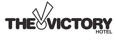
The Amart Sports updated logo features a medal and ribbon device incorporated into the new style font. The new ribbon design reportedly reflects the brand’s passion and enthusiasm for sport, however we couldn’t help but have a secret chuckle wondering if the logo concepts were drawn up whilst having a quiet brew at one of our own clients venues, the popular Victory Hotel in Brisbane’s CBD? Highly unlikely, but stranger things have happened in advertising land over a few beverages!
So, what are your thoughts regarding the rebrands? Let us know in comments! With retailers experiencing some seriously tough times we’ll be continuing to monitor and measure the effects of the rebranding.